BUILDING THE BLACK PRESS
  • Photo-Essays
  • BLOG
  • STORYMAPS
  • WALKING TOURS
  • Photo-Essays
  • BLOG
  • STORYMAPS
  • WALKING TOURS

BLACK BY DESIGN

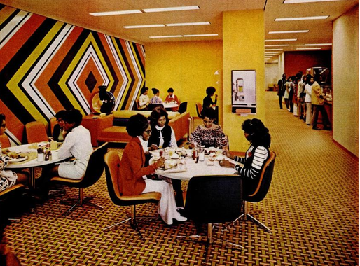
Staff canteen, 820 South Michigan Avenue
Ebony, 1972
Simply by existing, Black press buildings provided a reminder of the mission of Black periodicals to provide a "voice for the race" and reaffirmed the individual and collective significance of the Black press. Yet over time, these buildings took on broader performative roles. The interior and exterior design of Black press buildings became more than just a statement about editorial or political power. They were an extension of editorial and artistic values: a canvas upon which to craft new narratives and images of Black life, taste, culture, and modenity.

This would become increasingly important as technological and commercial advancements during the last two decades of the nineteenth century contributed to a wave of new and more impressive Black press offices. Within the increasingly congested literal and literary geographies of Black urban life, it was not enough for Black publications to simply own or inhabit physical buildings. Now, the design and aesthetics of these buildings would be used to demonstrate that individual publications were better able to articulate the complexity, beauty, and diversity of modern Black life.

​This sentiment was on clear display in an early issue of the 
Colored American, which moved its offices from West Canton Street in Boston to a new location at 5 Park Square in 1900. ​​​
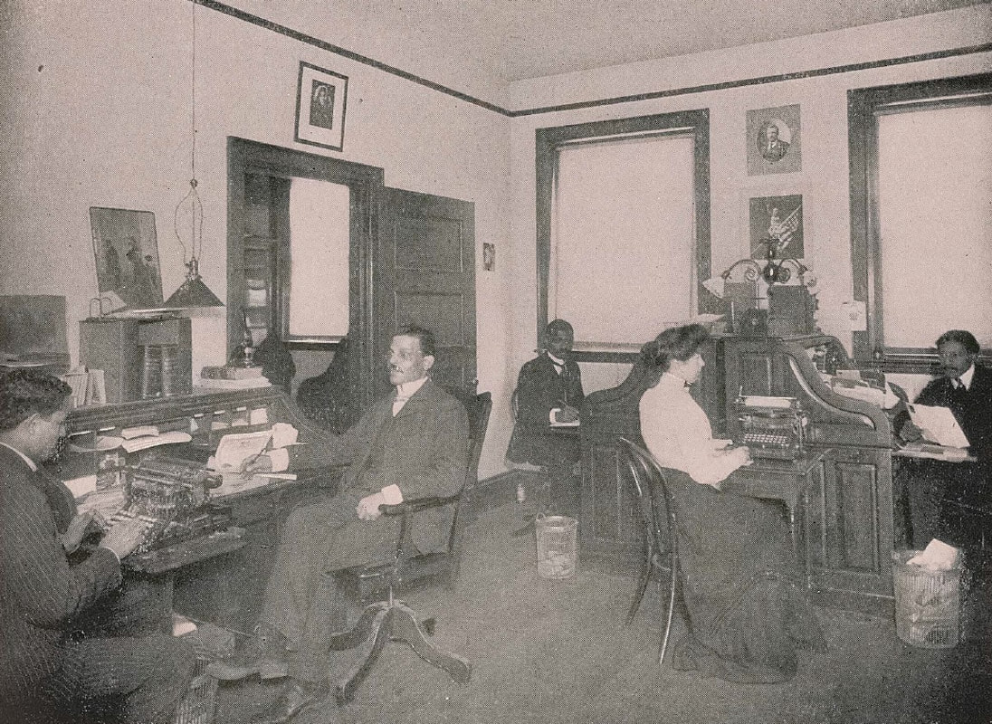
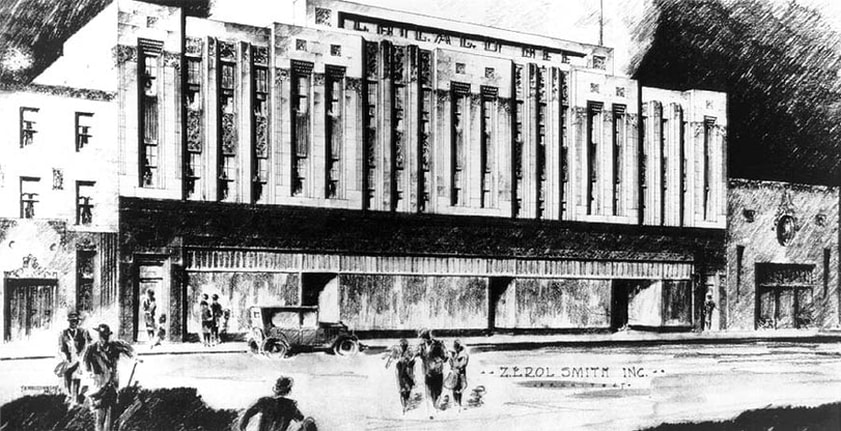
"At present time the Colored American Magazine occupies the most elaborate and best equipped rooms and offices of any race publication...an equipment that will easily place it at the head of all Negro Publishing Enterprises."
Furnishings and other interior features were used to visually craft a narrative of racial progress. Staged photographs of Black newspapermen and women 'at work' helped to reconfigure and repurpose the workplace in ways that reiterated the importance of independent Black publishing concerns.
Picture

​Black journalists at the Colored American offices, 1902. Colored American
In addition to size and the procurement of suitable equipment, Black publications also used the interior and exterior design of their buildings as a way of commenting on or showing evidence of their efforts to 'uplift the race.' The built environment became a way of projecting the editorial position or political mission of a given publication. This can be seen through the early development of the Richmond Planet, a newspaper founded in Richmond, Virginia in 1882 by a cohort of formerly enslaved African Americans.
Picture
Richmond Planet masthead
Under the leadership of John Mitchell Jr., the paper became an outspoken defender of civil rights and a militant voice for Black advancement. This message was embodied through its striking masthead, which featured a "powerful logo of a flexed, muscular black arm with a lightning bolt radiating out of its clenched fist." Before long, this image was also emblazoned on the exterior of the Planet building - a provocative sight during an era characterized by widespread anti-Black violence and a lynching epidemic.
Picture
The Richmond Planet building, c.1899. Library of Congress 
Large banners or logos painted onto the sides of Black press buildings helped them to assume an oversized role within the geography of Black urban life, one which reflected their own importance in shaping popular understandings of the Black public sphere. Clear demarcation also allowed Black publications to distinguish buildings from their previous function. When the Chicago Defender moved into a former synagogue at the beginning of the 1920s, the building was extensively redeveloped to remove most signs of its former life, while a huge sign was painted on the exterior wall designating the building as the new home of the "world's greatest weekly."
Picture
Chicago Defender building, 1923. Simm's Blue Book 
As the financial clout of Black publishers and business owners grew, some were able to finance the construction of new buildings that would embody the true 'spirit' of the periodicals which inhabited them.

An elegant example of this effort to align spatial and editorial representations of Black identity can be seen through the design and construction of the Chicago Bee building during the 1920s, which was financed by Black business magnate Anthony Overton. Built within the context of the "New Negro" movement and the ascent of architectural modernism, the building was an attractive, art-deco inspired addition to the South Side's skyline. 
Picture
Architectural rendering of the Chicago Bee building, 1929. National Parks Service
Described by the Chicago Tribune as a "modernistic bit for South State Street," the Bee building helped to position Overton's newspaper as a legitimate competitor to the Chicago Defender, which reigned supreme as the city's preeminent Black publication. Perhaps even more importantly, its ornate exterior served to distinguish the Bee's editorial focus and desire audience from that of the Defender.

While the Defender was undoubtedly popular, many of Chicago's Black bourgeoisie saw it as a 
distinctly lower-class affair - one which relied on sensationalism and the exploitation of reader fears and anxieties to help boost sales and circulation. By contrast, the Bee was a 'respectable' organ - a sedate and sophisticated publication which adhered to "professional journalistic standards and appeal[ed] to middle-class, conservative black Chicagoans." These lofty ambitions were embodied through the intricate terra cotta design which drew the eye of passing motorists and pedestrians.
Picture
Exterior of the Chicago Bee building, 2010. Flickr | Jyoti Srivastava
Arguably the most ambitious merging of publishing ambition and building aesthetics came with the construction of the Johnson Publishing corporate headquarters at 820 South Michigan Avenue, which was completed during the early 1970s. The building's striking exterior design was the work of Black architect John W. Moutoussamy, who had studied under Mies van der Rohe as part of the Illinois Institute of Technology's famed architectural program.
While Moutoussamy was well versed in the International style which dominated the work of many postwar modernist architects, publisher John H. Johnson was adamant that he didn't want another "glass shirt building." Instead, he wanted a distinctive structure that would stand out among the many impressive landmarks which dotted the city's South Loop neighborhood. Expanding on the advertising efforts of earlier Black press buildings, 820 South Michigan Avenue was topped by an enormous Ebony/Jet sign which was visible along much of the Lake Michigan shorefront between downtown and Museum Campus.

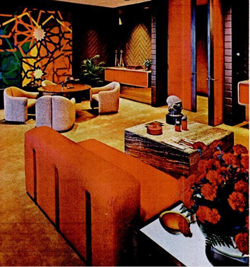
However, the real style was found on the inside of 820 South Michigan Avenue, where an interior design team headed by Arthur Elrod and William Raiser had curated an extraordinary ​vision of Black cultural mores. The company described the sites aesthetic as a blending of "ancient African art and futuristic furniture design," helping to connected appeals to Black cultural nationalism and diasporic design with a Black modernist chic that was rooted in the 1970s. ​
Picture
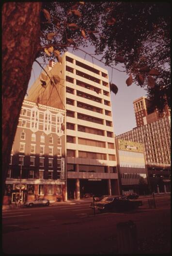
Johnson Publishing Building, 1973. John H. White | Documerica
Architectural critic Lee Bey describes the building's interiors as "an exuberant, high-style and fearless mix of a color, texture, art, contemporary furnishings and pattern...an afrocentric modernism that was well-turned, avant garde and quite hip - a perfect match for publisher John H. Johnson's groundbreaking magazines." Johnson himself used similarly effusive language in his address at the site's formal opening in 1972, describing his new corporate headquarters in these terms:
"A poem in marble and glass that symbolizes our unshakeable faith that the struggles of our forefathers were not in vain."
Picture
Picture
"Ebony Magazine's New Home." Ebony, 1972
In keeping with their emphasis on visual style and conspicuous consumption, the new wave of Black consumer magazines catering towards an upwardly mobile Black professional class, headed by publications such as Essence and Black Enterprise, took inspiration from the Johnson Publishing headquarters to create their own monuments to Black cultural and economic advancement. When Black Enterprise relocated from Madison Avenue to Fifth Avenue, publisher Earl Graves set out to create "an office of the future," but also hoped to provide his publication with an air of historical legitimacy.
"the rich history and fine tradition of the black press provided inspiration...it was this sense of meshing a bit of the past with the future that became the essential theme for the interior design and choice of furnishings." ​
Picture
Picture
"A Corporate Showcase," 1984. Black Enterprise ​magazine
Graves' desire to blend past and future - something which saw state-of-the-art office and publishing equipment interspersed with "old-world" quirks such as a spiral staircase and ornate chandeliers - reflected the enduring desire of Black publishers to both acknowledge the historical significance of the Black press and reiterate the continued relevance of Black publications to African American communities in the present.

SOURCES

  • Bey, Lee. "Soul Survivor: A Look at the Intact and Avant Garade Interiors of the Ebony/Jet Building," WBEZ Chicago, January 14, 2013.
  • "A Corporate Showcase," Black Enterprise, October 1984.
  • "Doing Business with Friends," Black Enterprise, October 1984.
  • "Ebony Magazine's New Home," Ebony, September 1972.
  • West, E. James. A House for the Struggle: The Black Press and the Built Environment in Chicago (Illinois, 2022).
  • Williams, Michael. "The Chicago Bee Building," BlackPast, ​June 15, 2014.
Powered by Create your own unique website with customizable templates.